Subscriptions
Purchases went up and churn came down. Paying for vidIQ, a subscription app for YouTube creators, started as an old Stripe widget and grew into plans, credits and checkout, drawn differently for onboarding than for halfway through a prompt in AI Coach. I worked on it with the growth team. Exact figures stay private.
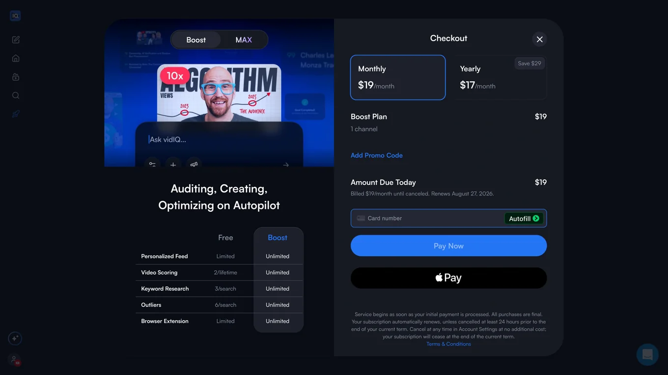
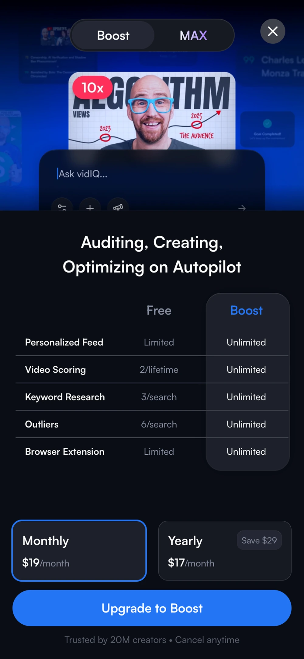
Checkout stayed in the modal, where it converted
Benchmarks had checkout on a page of its own rather than inside a modal, so we tried it. Our users reacted badly, the old way was still converting better, and we put it back. Something working somewhere else did not mean our own people would take it the same way.
It never became a written rule, just something we knew after that. Pulling somebody out of what they were working on, free or paying, was abrupt for our users. So we stayed with the modal, watched session recordings and kept looking for ways to take up less room. The meter came from the same place. A creator could see what they had left and upgrade right there if they were running low, which made it a passive upgrade instead of something put in front of them.
Credit components a PM could ship from
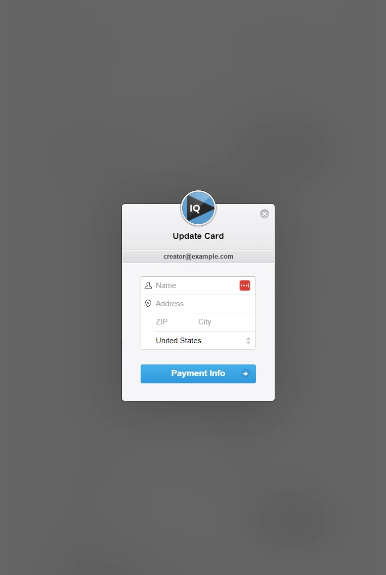
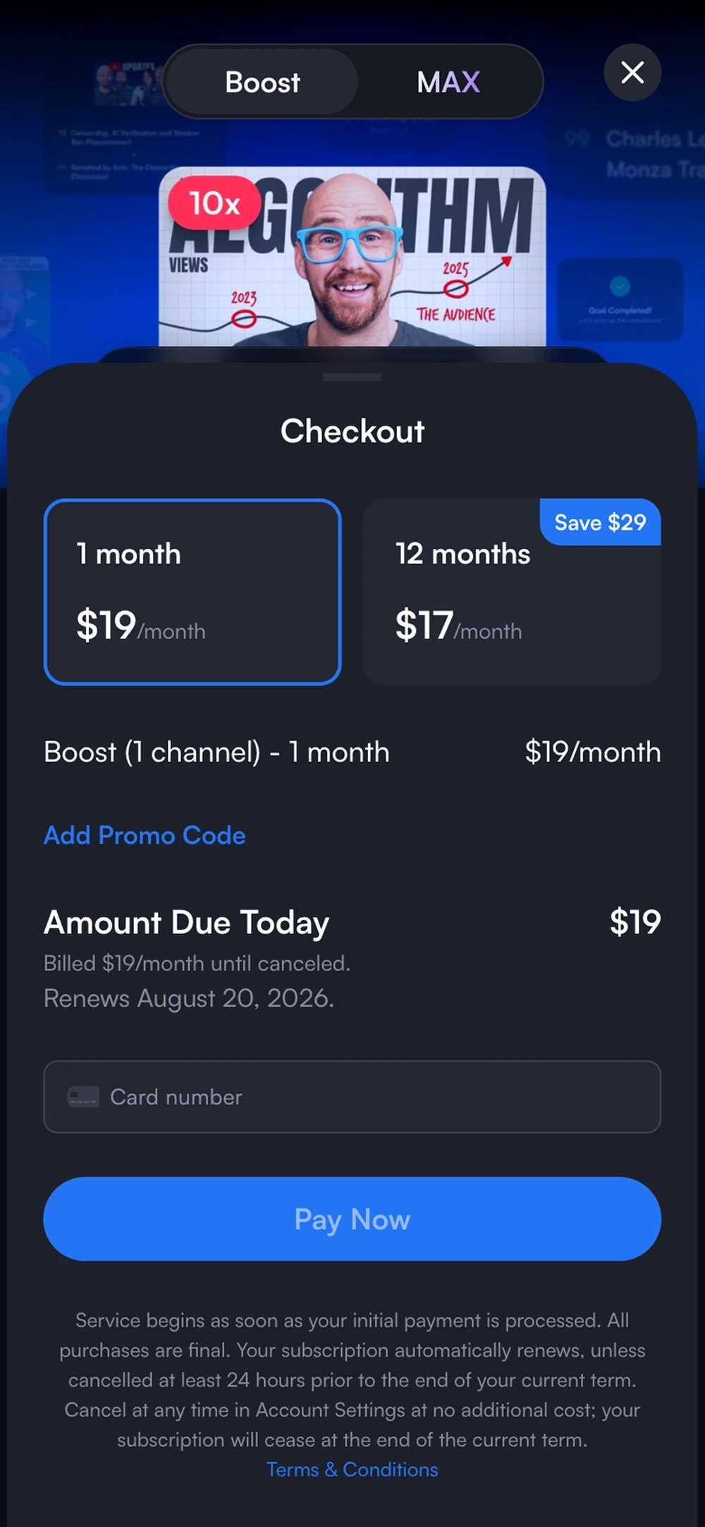
vidIQ built a credit system when the AI features arrived, and I designed the components for it in our design system. The plans page needed a version with credits on it, which growth and I went through a few passes to land.
Then our growth PM built the page himself. He drew on pieces already sitting elsewhere in the product, worked it out with Claude against the Figma, and had it put together from the same parts. He sent me the preview, I gave feedback, and engineering shipped it. Somebody who is not a designer shipped production UI that looked like the product, because the parts he was working with were already right. The same components carried both themes. The color lives in tokens, so a plan card or an upsell renders right in either one and nobody rebuilds a screen to switch between them.
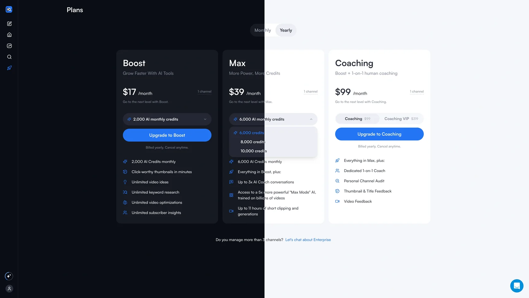
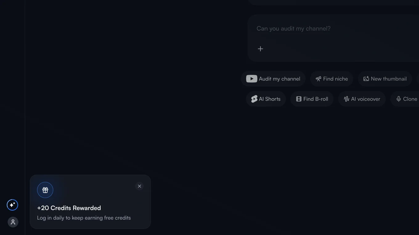

Where the upsell changes
What an upsell had to do changed with where it met you. In onboarding it came right after we had scored one of your videos and put a better title on it, so it had something behind it during a high intent moment. One auto upsell did most of the work everywhere else. Time it wrong and you lose them, or at best somebody writes in about it.
MAX worked the other way around. You got there by picking it out of the mode list, or by running into a credit limit mid-prompt. Either way you were in the middle of something, so it stayed out of your way. A slider for how many credits you wanted, monthly or yearly, and you were back in the prompt you left.
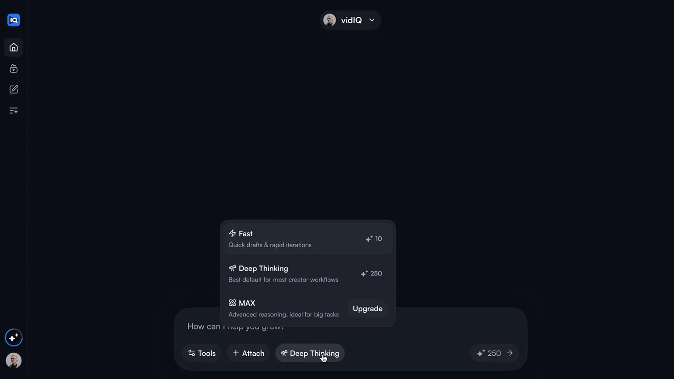
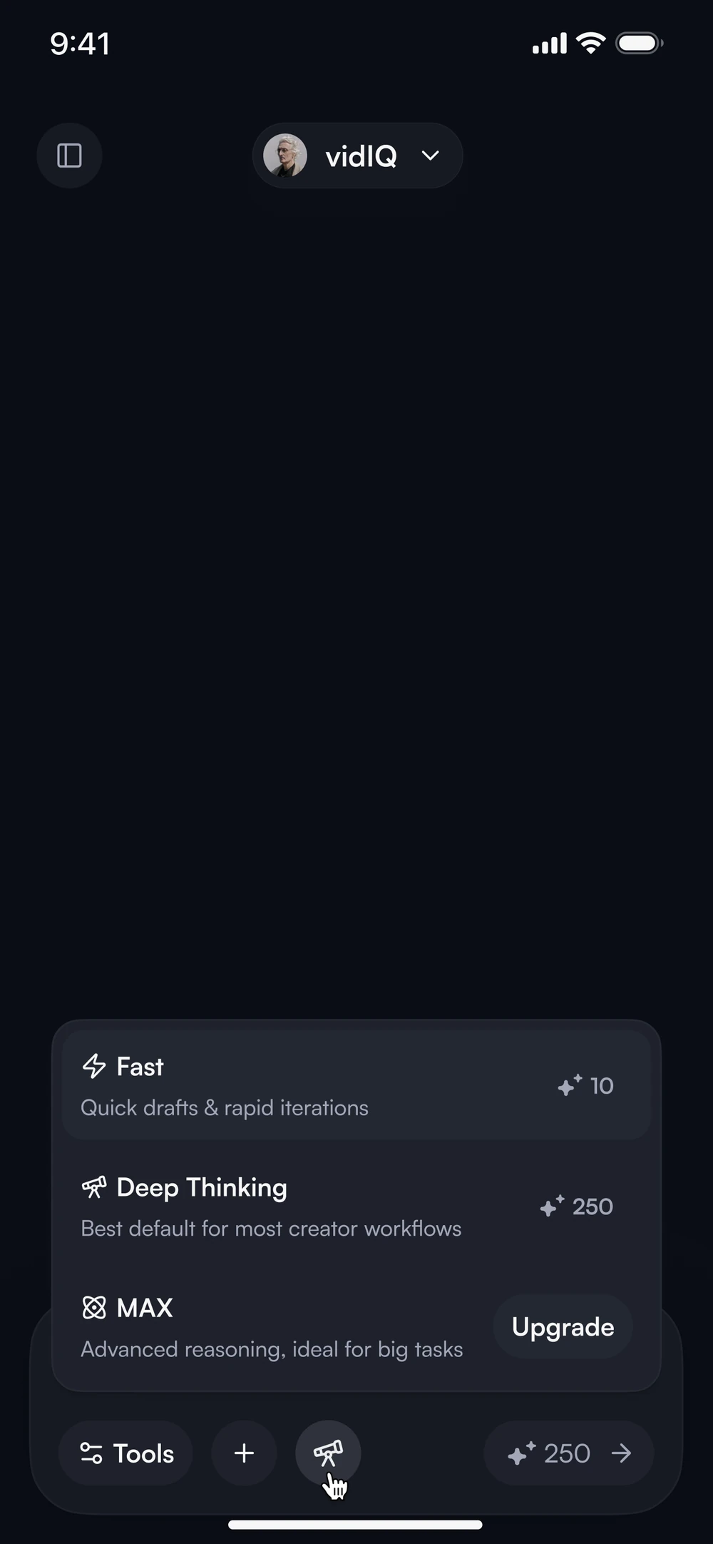
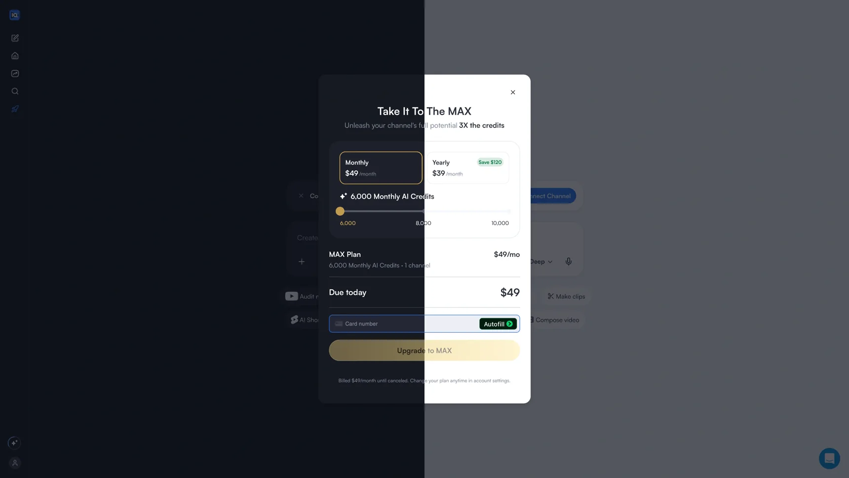
What the upsell promised, checkout charged
All of them had to carry currency across first, second and third tier countries, the plans, what Stripe and PayPal require, and whether somebody could read any of it.
Whatever the upsell promised had to match what checkout charged, what the account page said afterwards, and what the product actually did once they were paying. Money is what people contact support about, and any gap between those four lands there. On the other side is a person with a card in their hand deciding whether to trust you well enough to swipe.
One plans pattern for the app and the marketing site
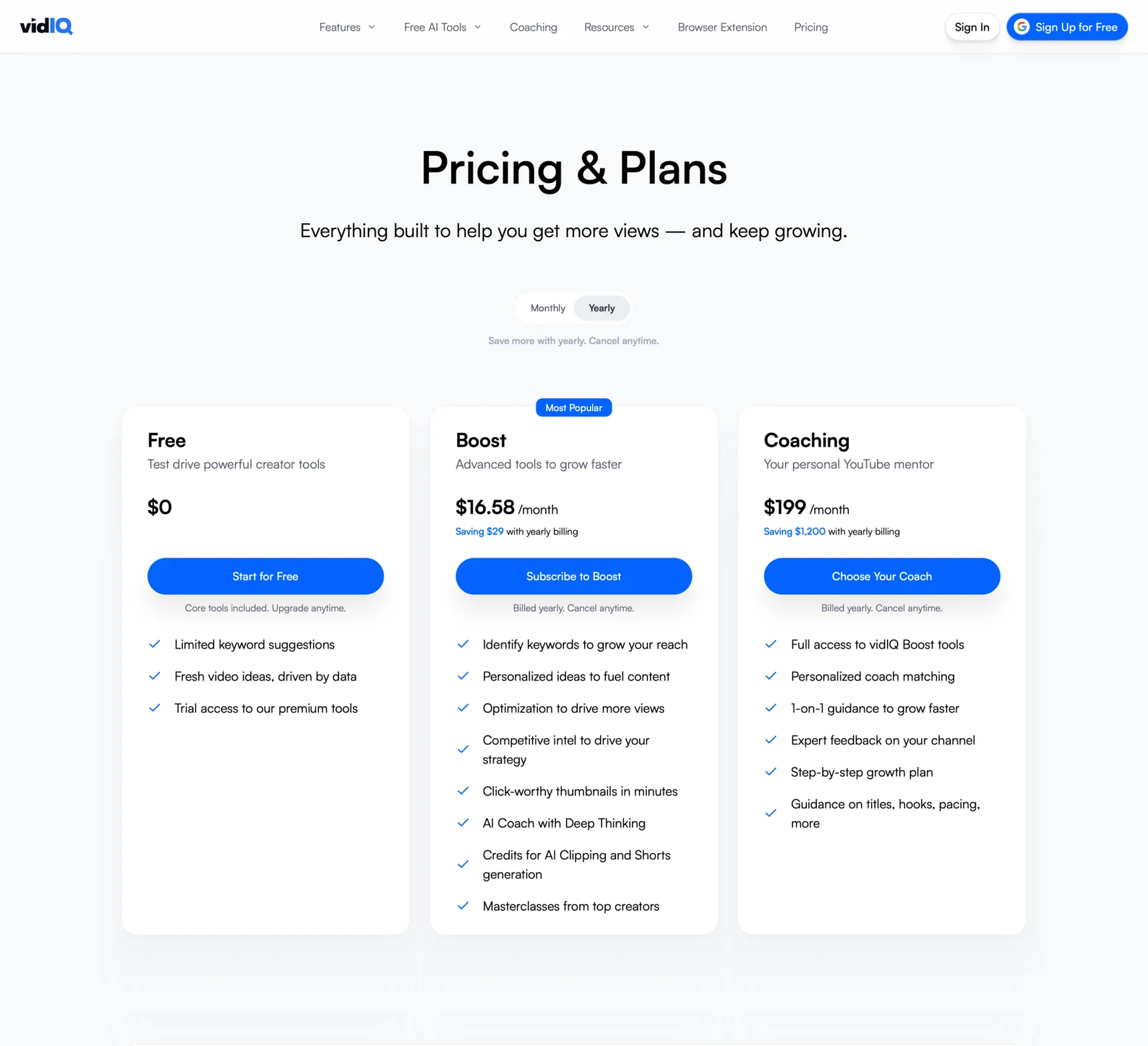
The plans page in the web app went through round after round for years, the tiers, how it held up on a phone, and how somebody got to it at all. The marketing site took the same pattern and said it differently, because inside the app a plans page was talking to somebody who already used the product, and out there it was talking to a stranger. One moved you up. The other had to get you started.
I worked with Pat for almost six years. We first worked together when we were both on the Growth squad tasked with iterating and refining our checkout and billing experience. Pat’s attention to detail in design and overall knowledge of product growth as a whole is really second to none.
Pat’s core strength is that he really understands the product and defines clear goals on what he wants to get out of an experience. He collaborated closely with Engineering and the Product team throughout. I remember one instance where I completely whiffed an implementation of a design – I missed all of the little details that made the experience great. Pat and I sat down and he not only pointed out where I went wrong, he also explained why certain design decisions were important. It was a learning experience for me and his patience and expertise really shone through.
What really stands out to me about Pat is his friendly, personable, and approachable demeanor truly make him both a pleasure to work with and also an invaluable teammate. Over the years Pat and I have worked in varying degrees of proximity when I moved to a different squad – but he was always there to offer feedback and guidance from a design perspective.
Pat was super helpful and collaborative when building out our design system. For a while, design and engineering didn’t have a shared language. Pat worked closely with the rest of the design team and the front-end team to help ensure that we’re all on the same wavelength.
Working with Pat was an all-round excellent experience.
